Visualizing Flight Options
Few routine consumer purchases involve as great a volume of data as booking a flight. For an international trip, there can be dozens of options differing by price, duration, time-of day, connections, and carrier alliances. ITA Software, now part of Google, quietly introduced a Gantt chart-style visualization. The use of Gantt-charts for flights has since been perfected and popularized by Hipmunk. Hipmunk set the bar high, especially for domestic flights, by polishing the design and distilling the data to the minimum needed to book a flight.
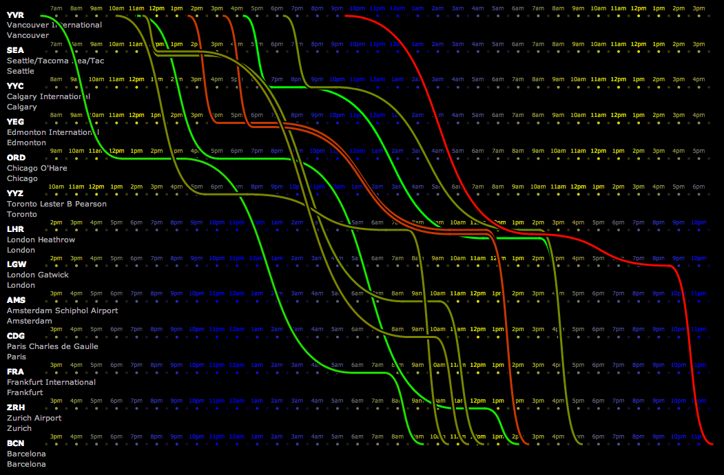
While I like the Gantt-chart layout for domestic flights, I wondered if the information density could be higher for international flights. Rather than grouping flights by price (or a combined score, as Hipmunk does by default), I wanted similar flights to be grouped together. Prices tend to cluster at various pricepoints due to competitive pressure, but these clusters theselves can have large variance. To account for this I wanted to emphasize relative prices rather than ranked prices. Because international flights may involve unfamiliar airports, I wanted room for the city and full name of each airport. Also, because international flights can involve many time zones, I wanted the relative times in each city to be shown.
With this in mind, I set the X-axis to the time and the Y-axis to the airports. Flight options are represented as a curve travelling through the airports, with flat lines for connections. Each airport has its own time scale according to the local time-zone. The flights are colored on a linear scale from the cheapest (green) to most expensive (red). The exact details appear when the user moves their mouse over a flight, at which point the price and airlines are revealed. Because I wanted to emphasize relative price, I had to de-emphasize carriers, but flights are colored by carrier when the details are shown.
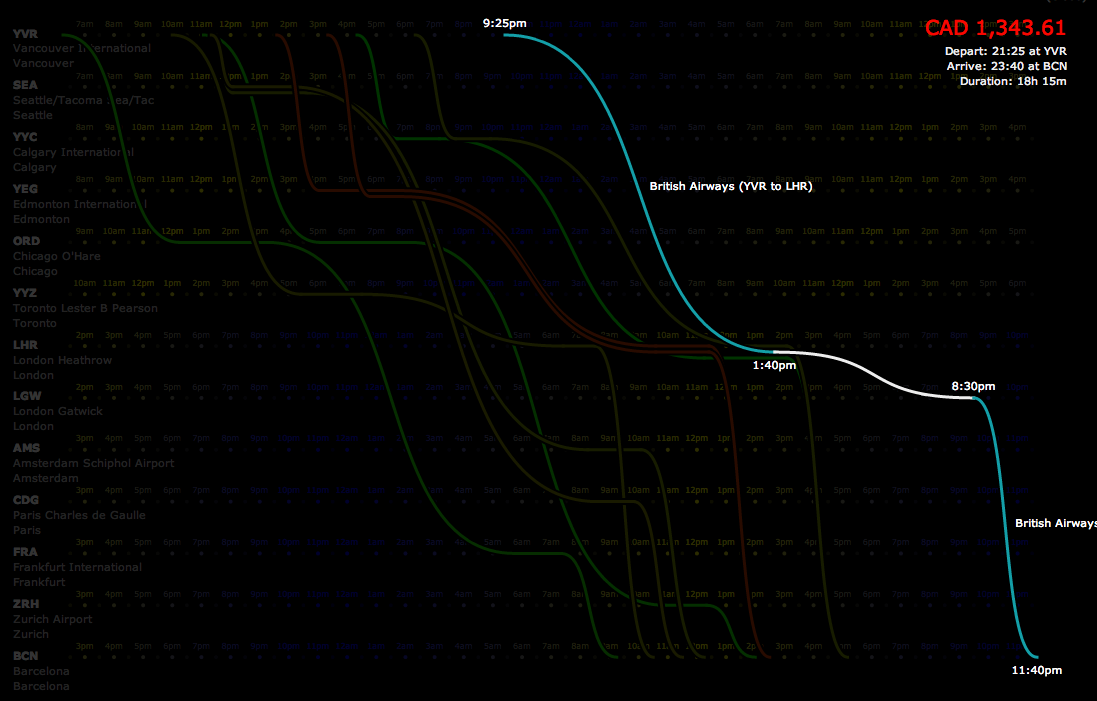
Although this was created in the spirit of experimentation, the result is a bookmarklet that is fully usable for booking flights. The bookmarklet applies the visualization to data available on any ITA Matrix Time bars results page.
Update: changes to the ITA Matrix have broken the code, so I have removed the bookmarklet. The code remains available here.